Hire on Contra

Zenrock Website Design(MVP)

Zenrock Website Design(MVP)

Zenrock enables decentralized key management for builders of cross-chain protocols and wallets to unlock omnichain security.

Problem

Very Simple Landing Page: The initial landing page lacked engagement and failed to capture the dynamic essence of Zenrock. It offered minimal information and visual appeal, leading to high bounce rates. No Consistent Branding: The website lacked a cohesive visual identity, making it difficult for visitors to associate the site with Zenrock’s brand. This inconsistency diluted brand recognition and trust. Very Few Design Elements: The site was sparse in design elements, which made it appear unprofessional and unfinished. This minimalistic approach did not effectively convey the complexity and reliability of the crypto project.

Solution

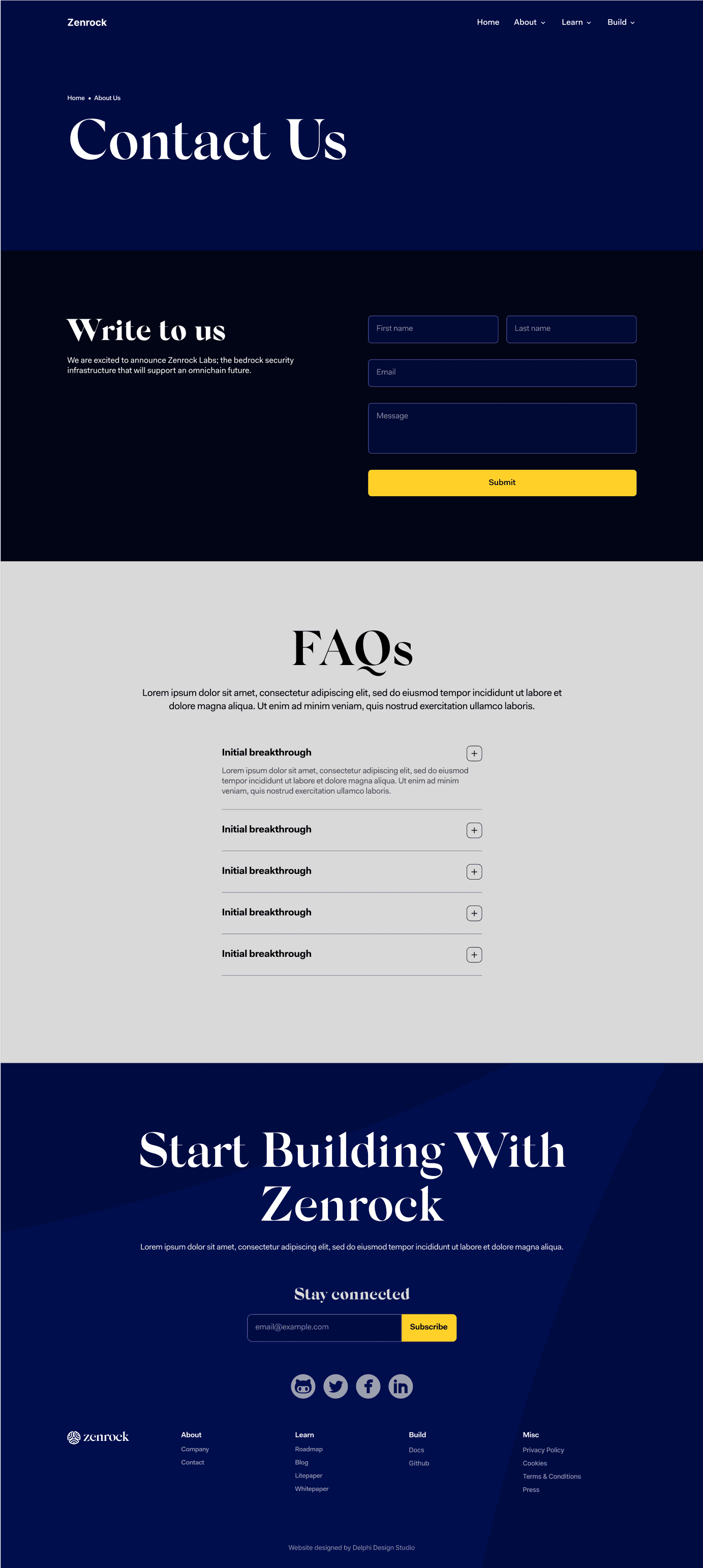
Branded Design: Utilizing the established branding guidelines, I developed a cohesive and memorable brand identity across the website. This included the use of a consistent color scheme, typography, and visual elements. Homepage, About Us, and Contact Us Pages: Key pages were created to provide essential information and improve navigation. The homepage was designed to be engaging and informative, showcasing Zenrock’s unique selling points. The About Us page offered insights into the team and the project’s mission, while the Contact Us page facilitated easy communication with potential investors and users.

Homepage wireframe

About us wireframe

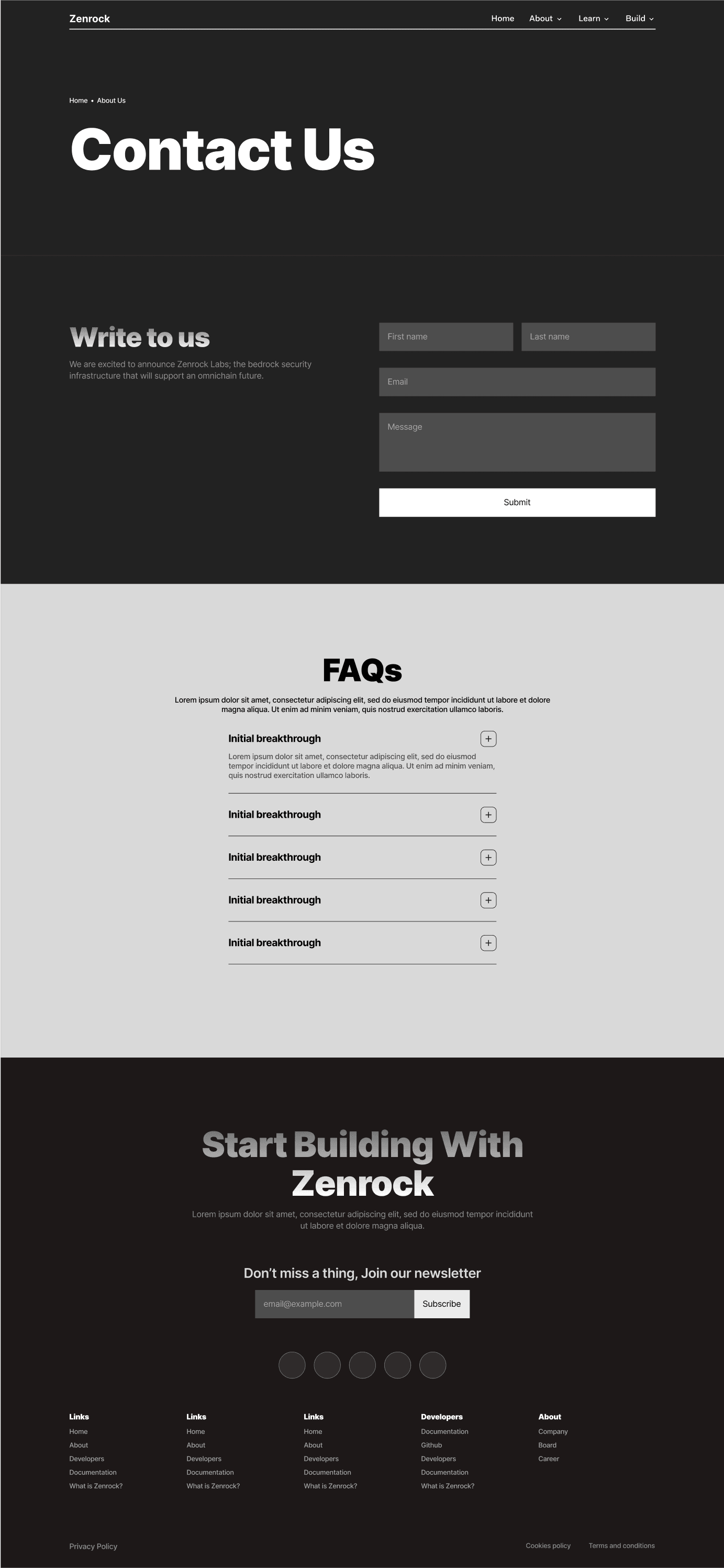
Contact us wireframe

Reflective of the Crypto Character: Given Zenrock’s position in the cryptocurrency market, the design had to embody the forward-thinking and innovative spirit of the industry. I used modern, sleek design elements that conveyed security, trust, and technological advancement.

  • Modern and Responsive Design: The website features a modern aesthetic with a responsive design, ensuring seamless functionality across all devices, from desktops to smartphones. This inclusivity broadens Zenrock’s reach and enhances user experience.

Design Process:

UX/UI Wireframe: I began with detailed wireframes to outline the structure and layout of the website. This phase focused on user experience, ensuring intuitive navigation and logical flow of information.

High Fidelity Designs: Once the wireframes were approved, I moved on to creating high-fidelity designs. These included detailed visuals that showcased the final look of the website, complete with branding elements and polished graphics.

Framer Development: The final phase involved developing the website using Framer. This stage brought the designs to life with interactive elements, animations, and a responsive framework, ensuring a dynamic and engaging user experience.

Conclusion:

The redesign of the Zenrock website transformed it from a simplistic and unremarkable site into a sophisticated, branded, and user-friendly platform. This comprehensive overhaul not only improved aesthetics and functionality but also strengthened Zenrock’s online presence, aligning it with its cutting-edge crypto offerings. By adhering to established branding guidelines, the new design successfully conveyed the project’s innovative character and secured its position in the competitive cryptocurrency market.

Year

2024

Year

2024

Year

2024

Timeframe

1-2 Months

Timeframe

1-2 Months

Timeframe

1-2 Months

Tools

Figma, Framer

Tools

Figma, Framer

Tools

Figma, Framer

Category

UI/UX

Category

UI/UX

Category

UI/UX

Homepage High Fidelity

About us High Fidelity

Contact us High Fidelity

Say hello

I'm open for freelance projects, feel free to email me to see how can we collaborate

Say hello

I'm open for freelance projects, feel free to email me to see how can we collaborate

Say hello

I'm open for freelance projects, feel free to email me to see how can we collaborate